Destine Viagens
Destine Viagens is a company that offers personalized travel services and travel agencies. To celebrate its 10th anniversary, the brand decided to revamp its visual communication to present a more mature, contemporary brand that connects with its target audience. Through strategy, market research, and references, we understood the true essence of the brand and were able to transform this concept into an original and clear visual language.
Challenge
The challenge was not only to modernize the brand so that it would be more accessible to the public, conveying its values and qualities, but also to break away from the common standards of this market.

Solution
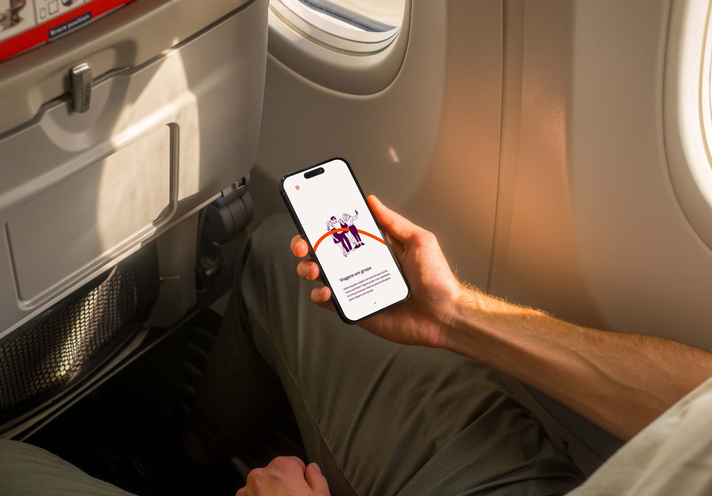
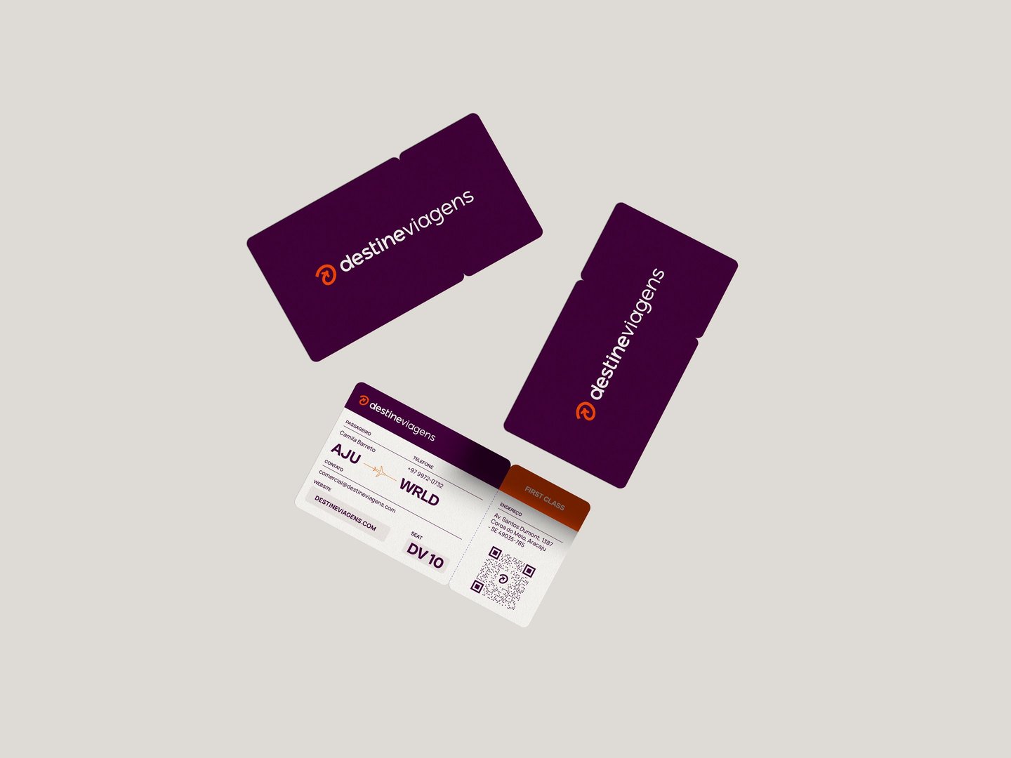
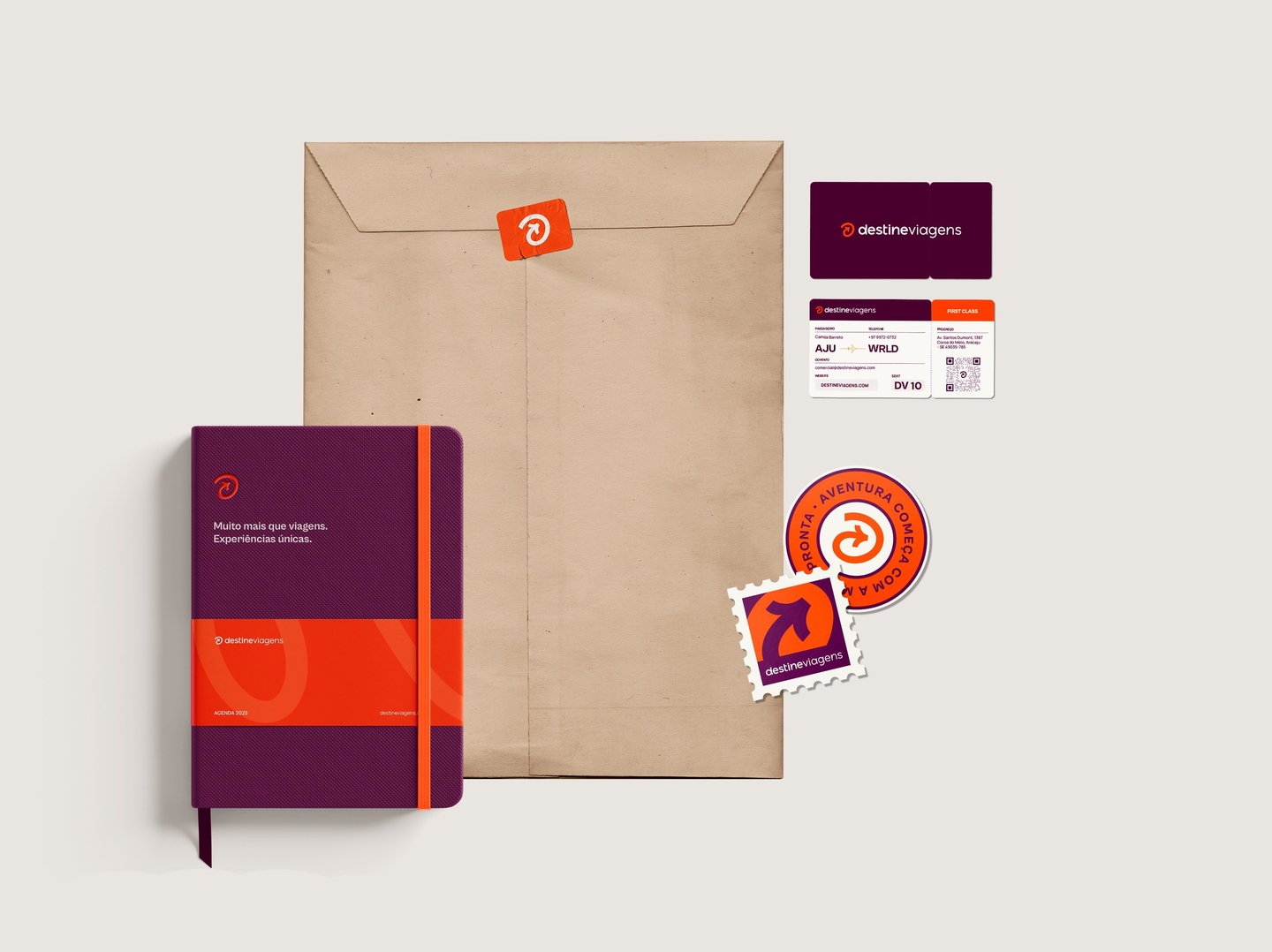
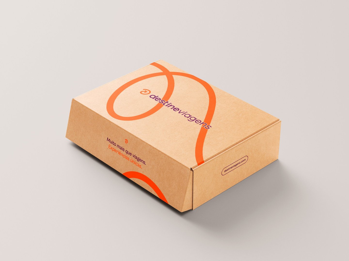
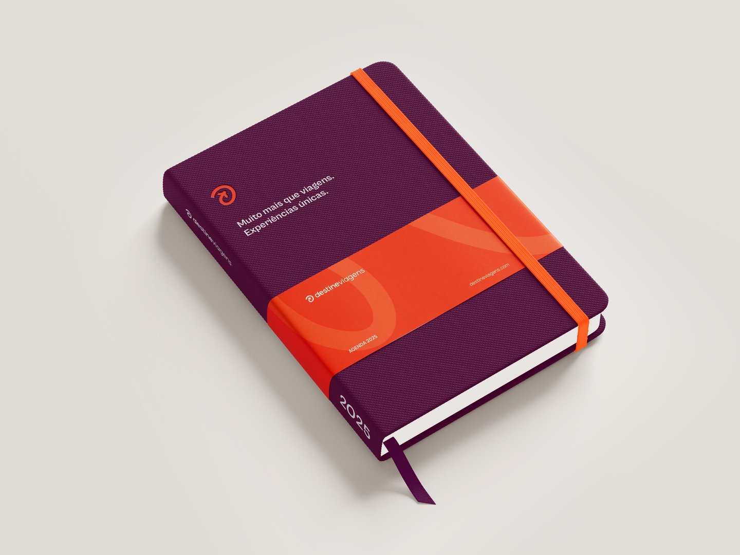
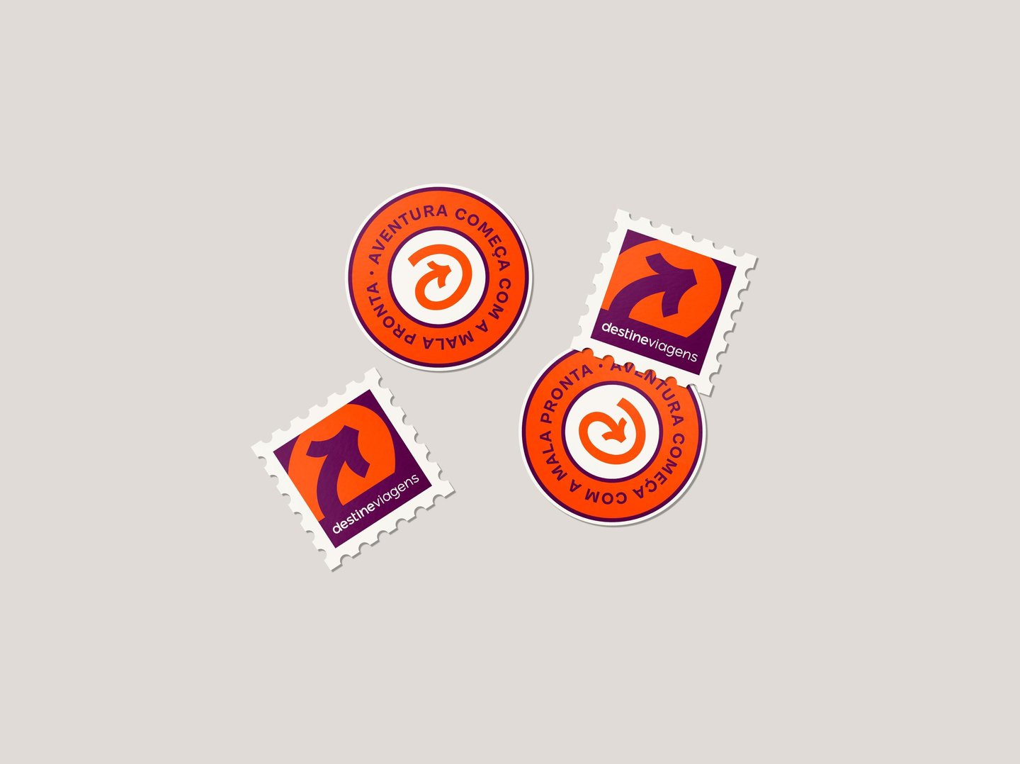
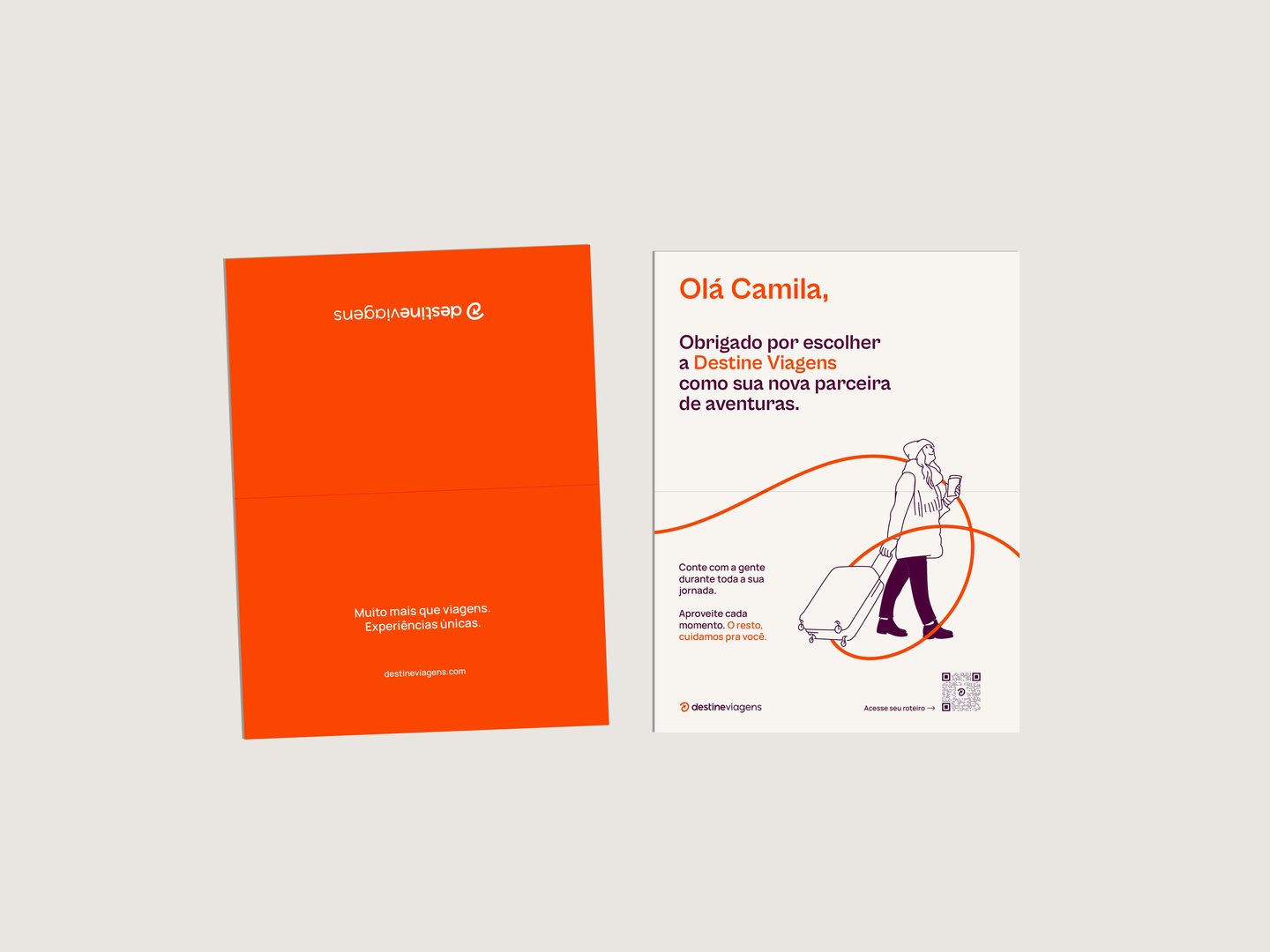
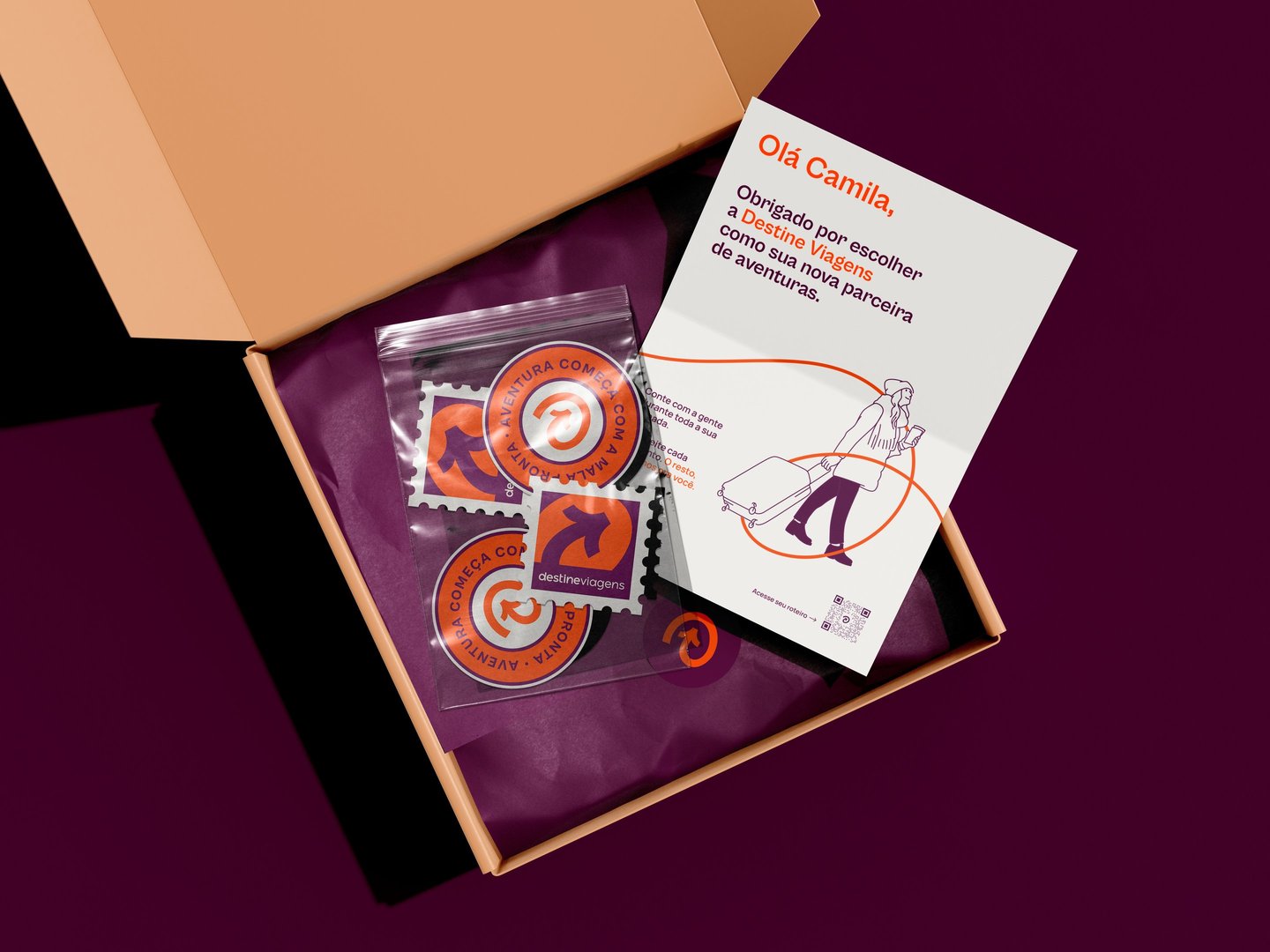
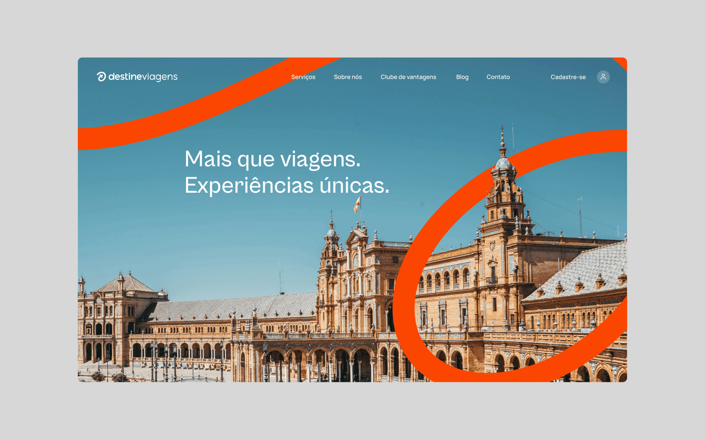
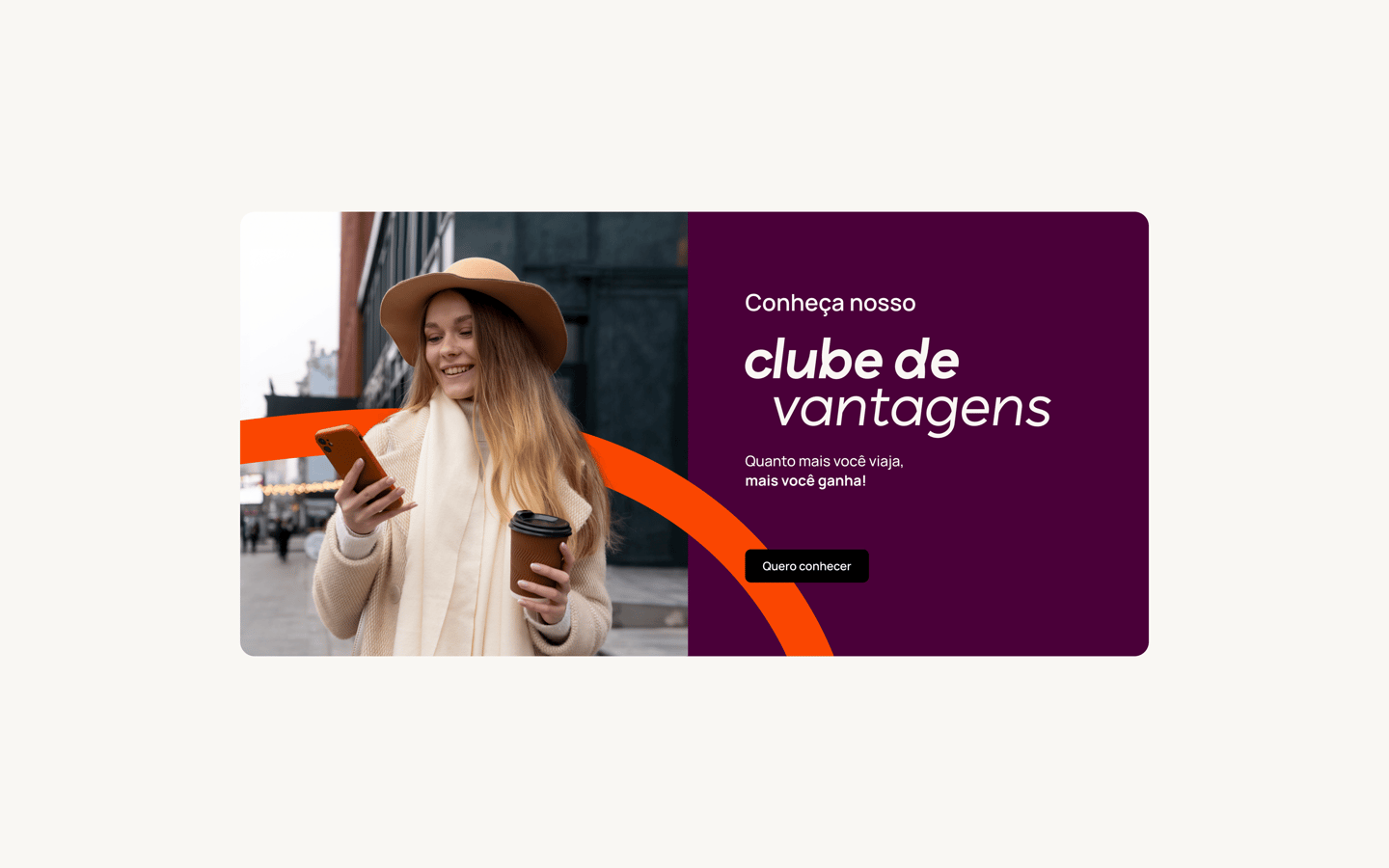
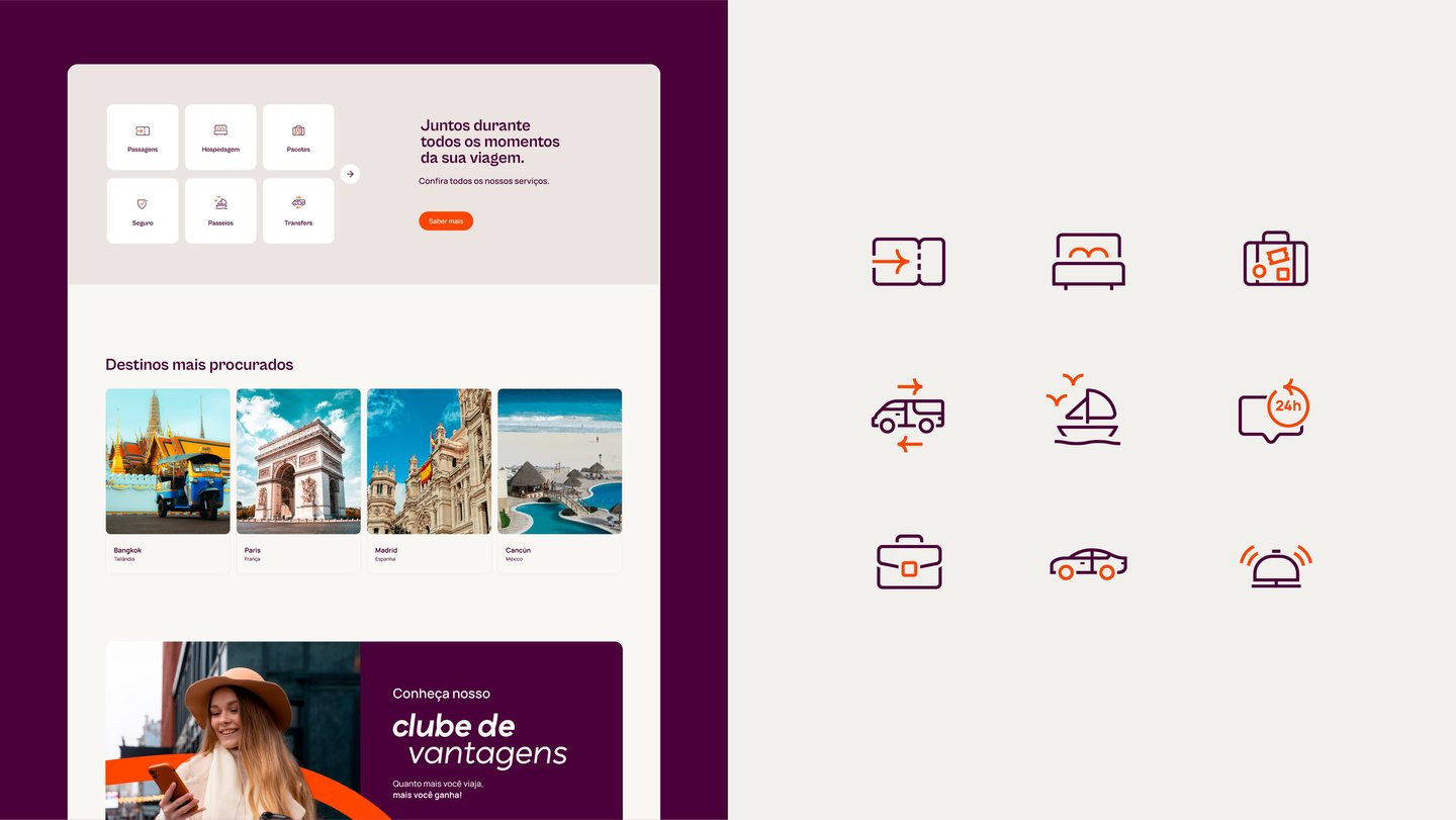
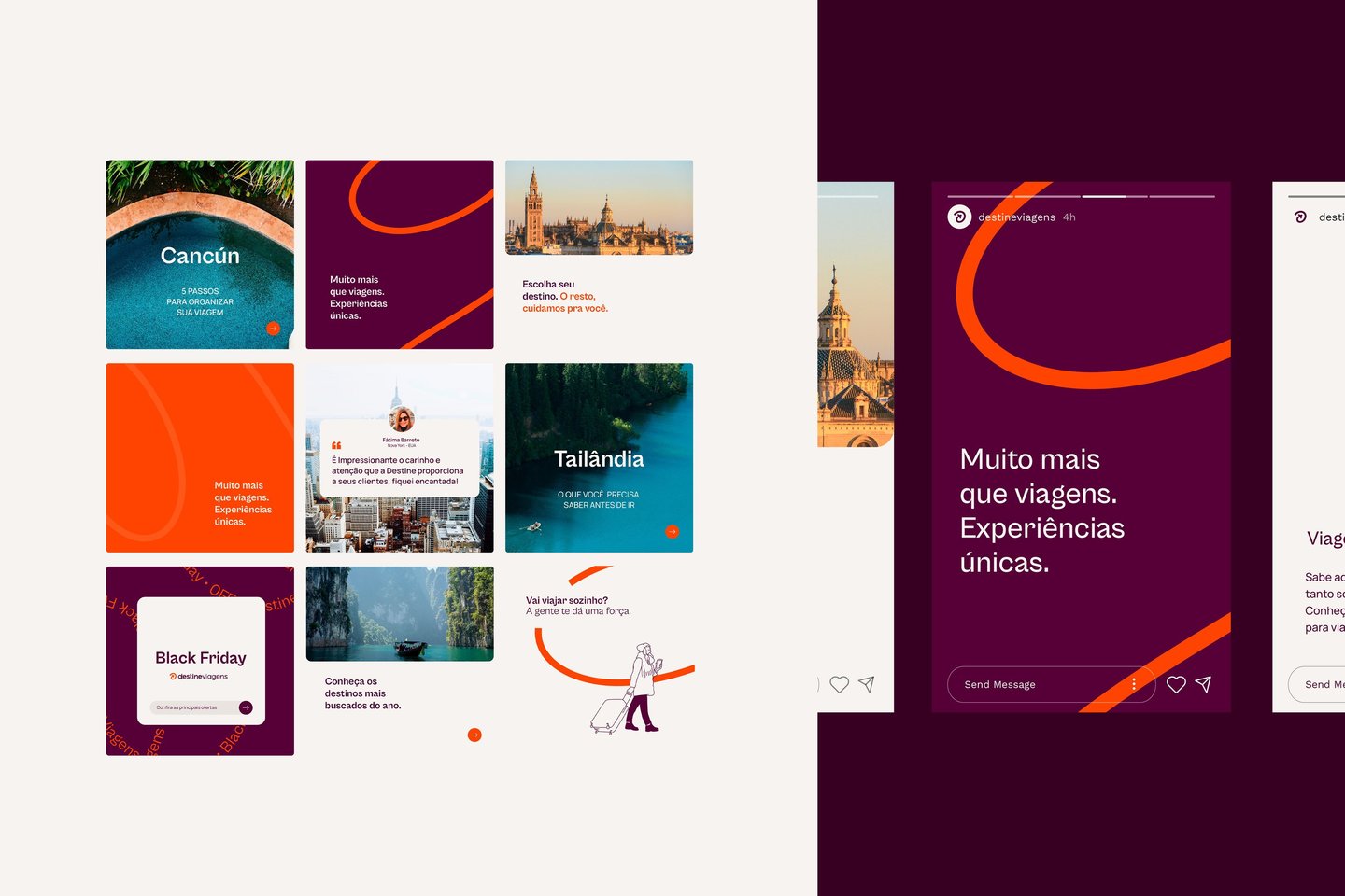
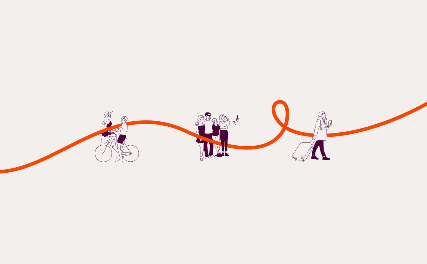
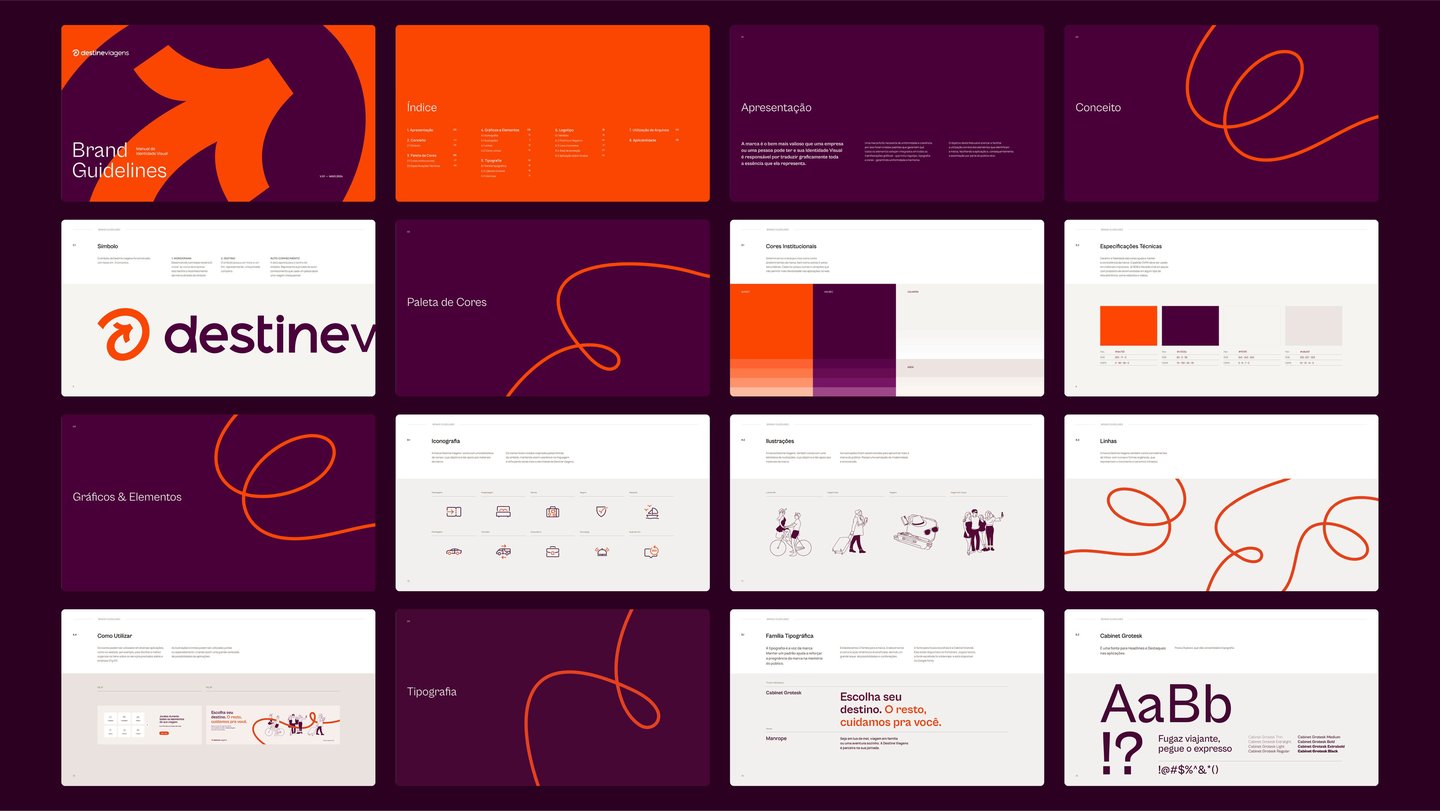
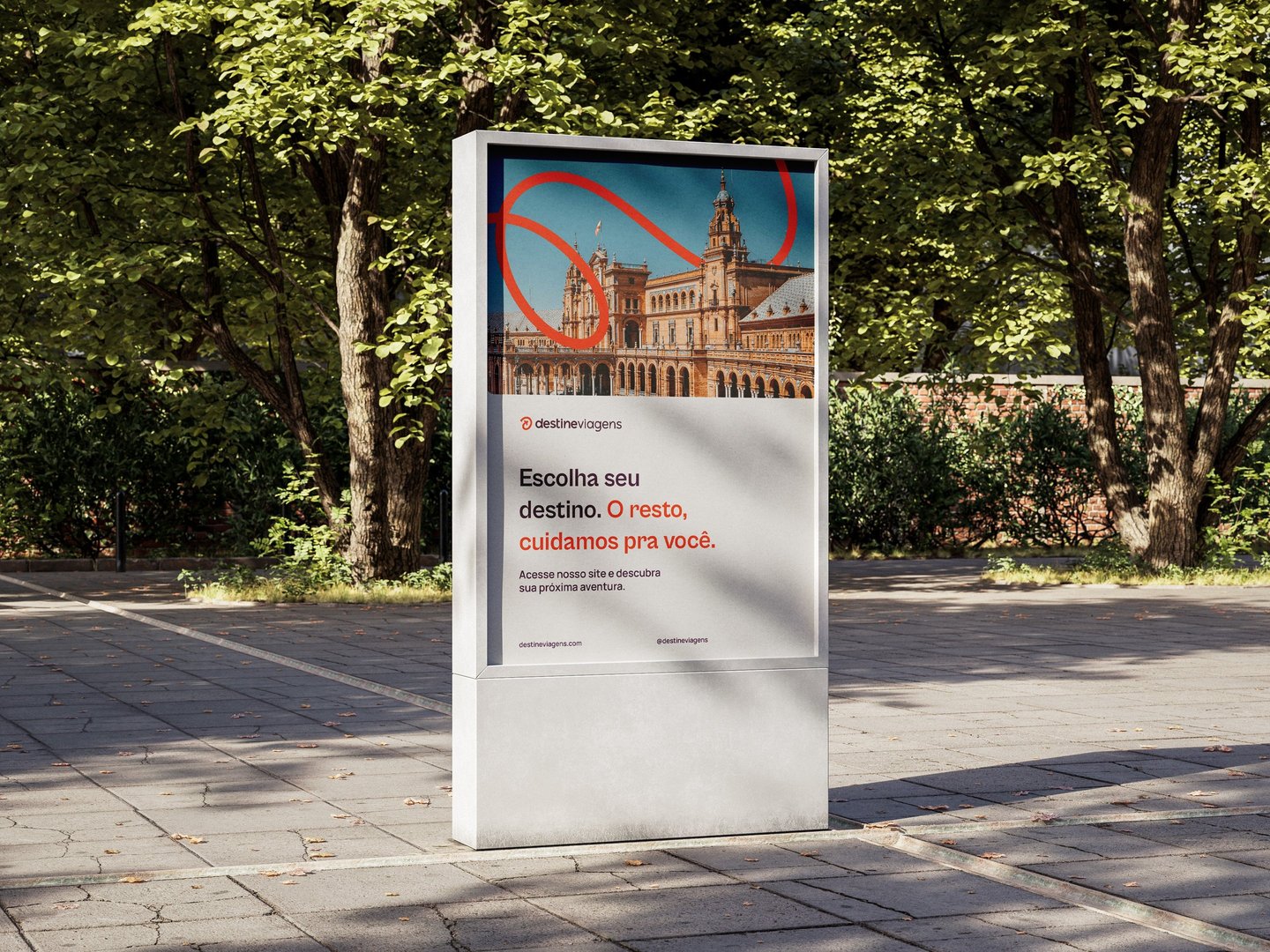
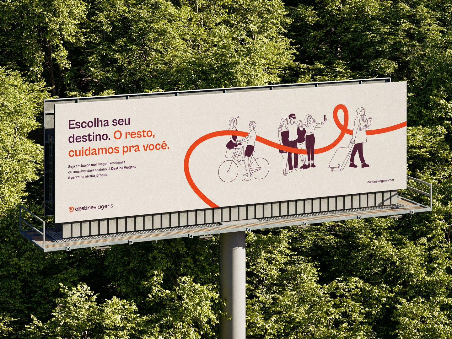
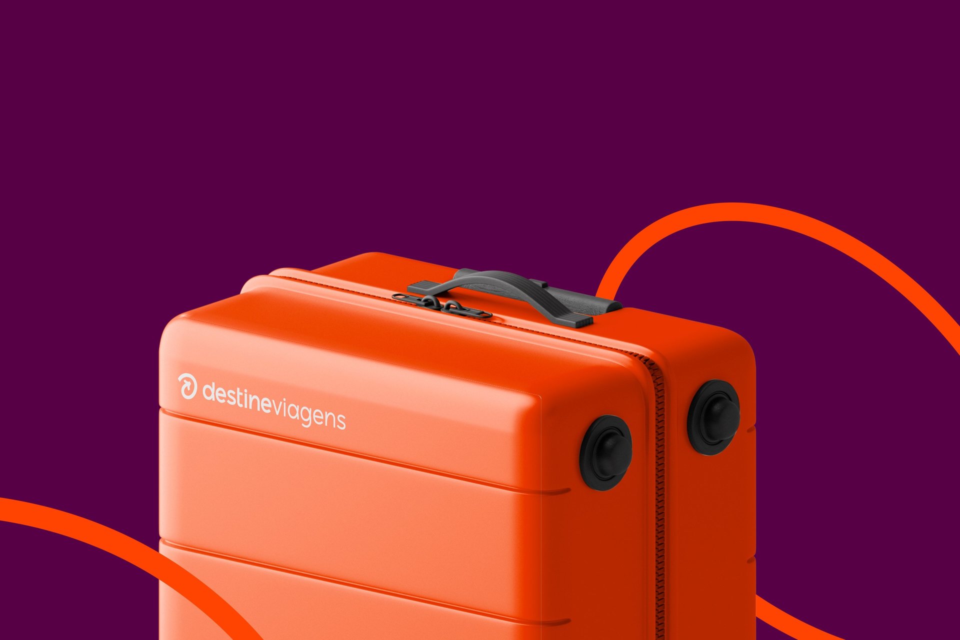
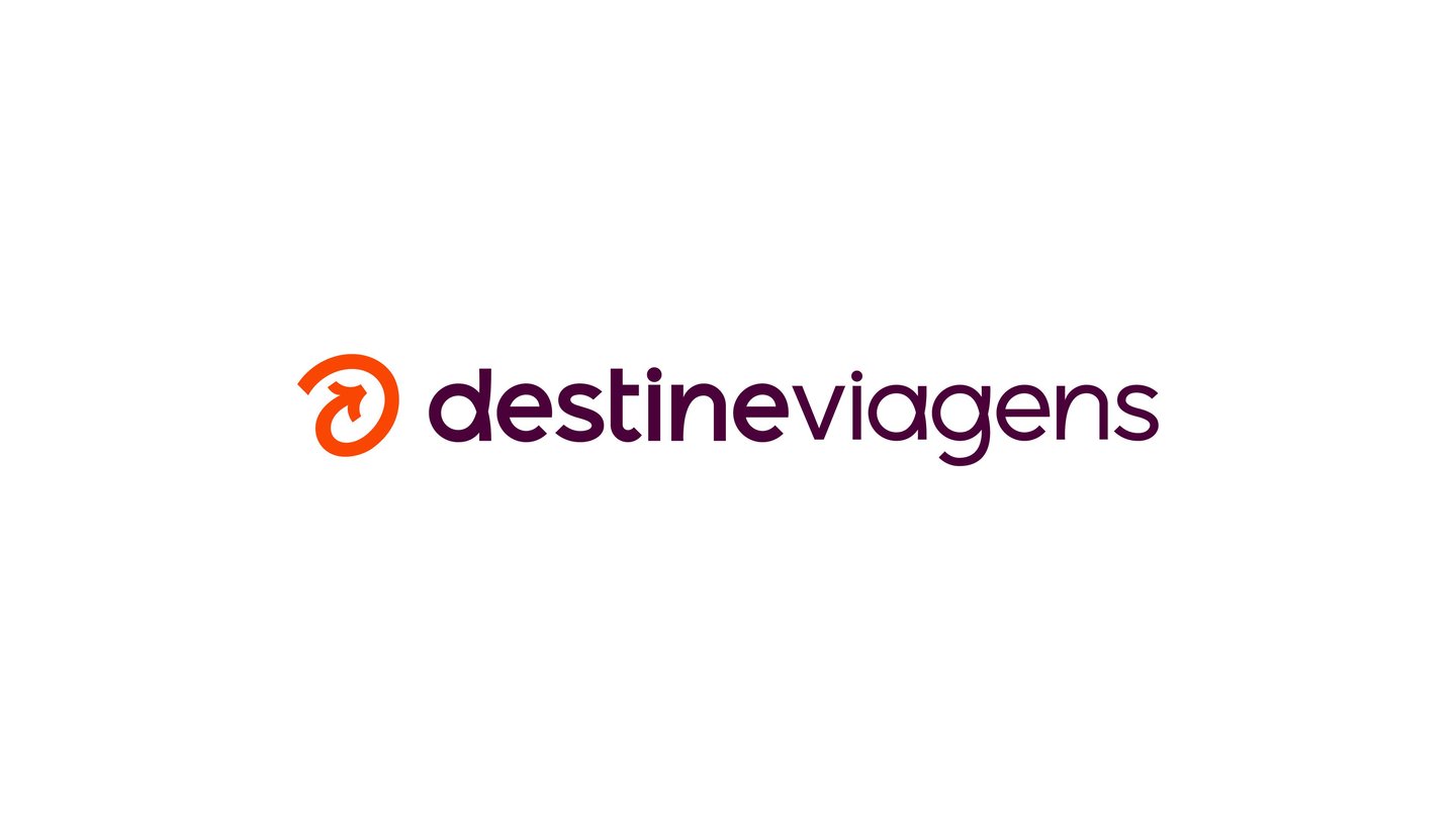
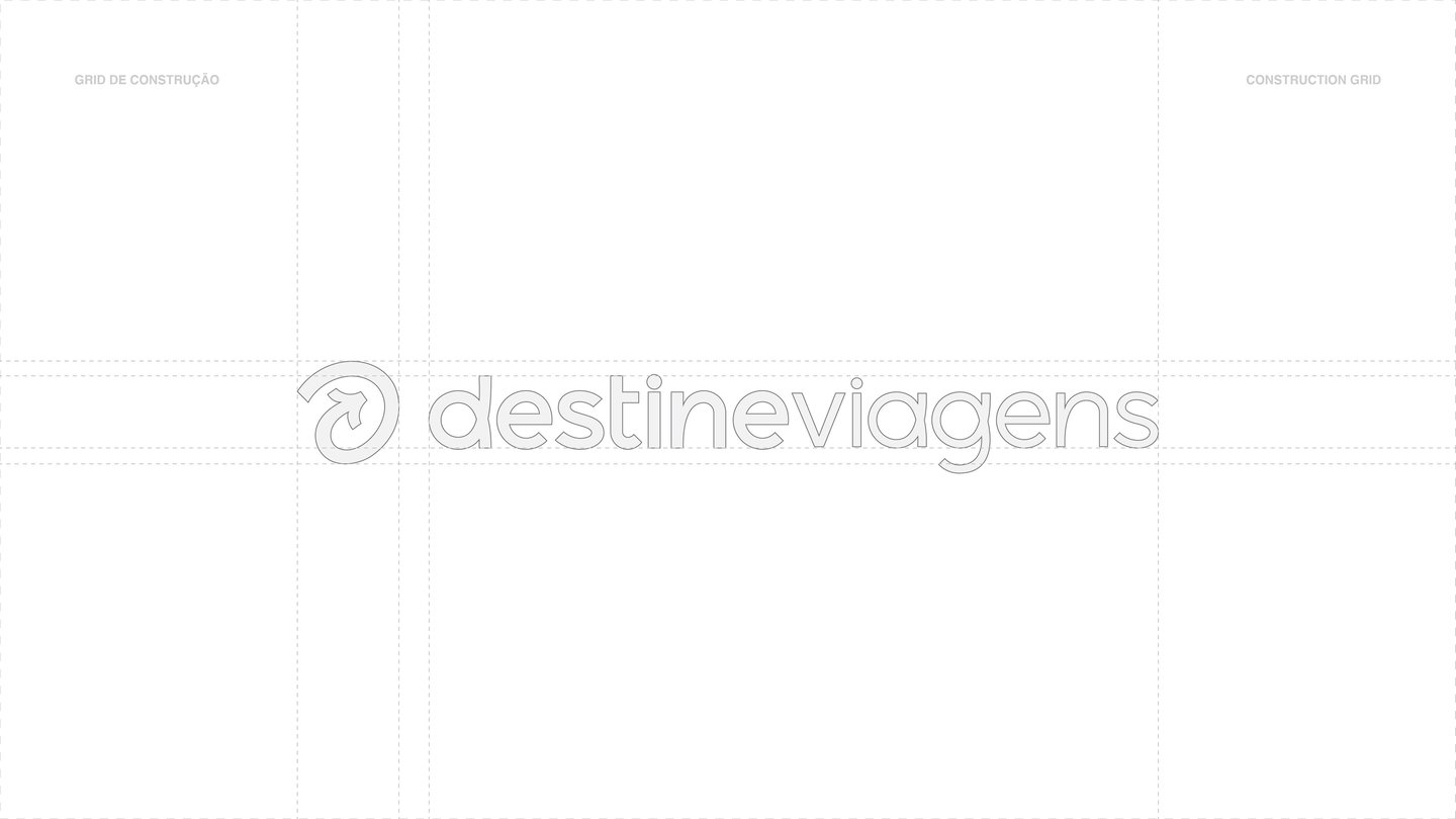
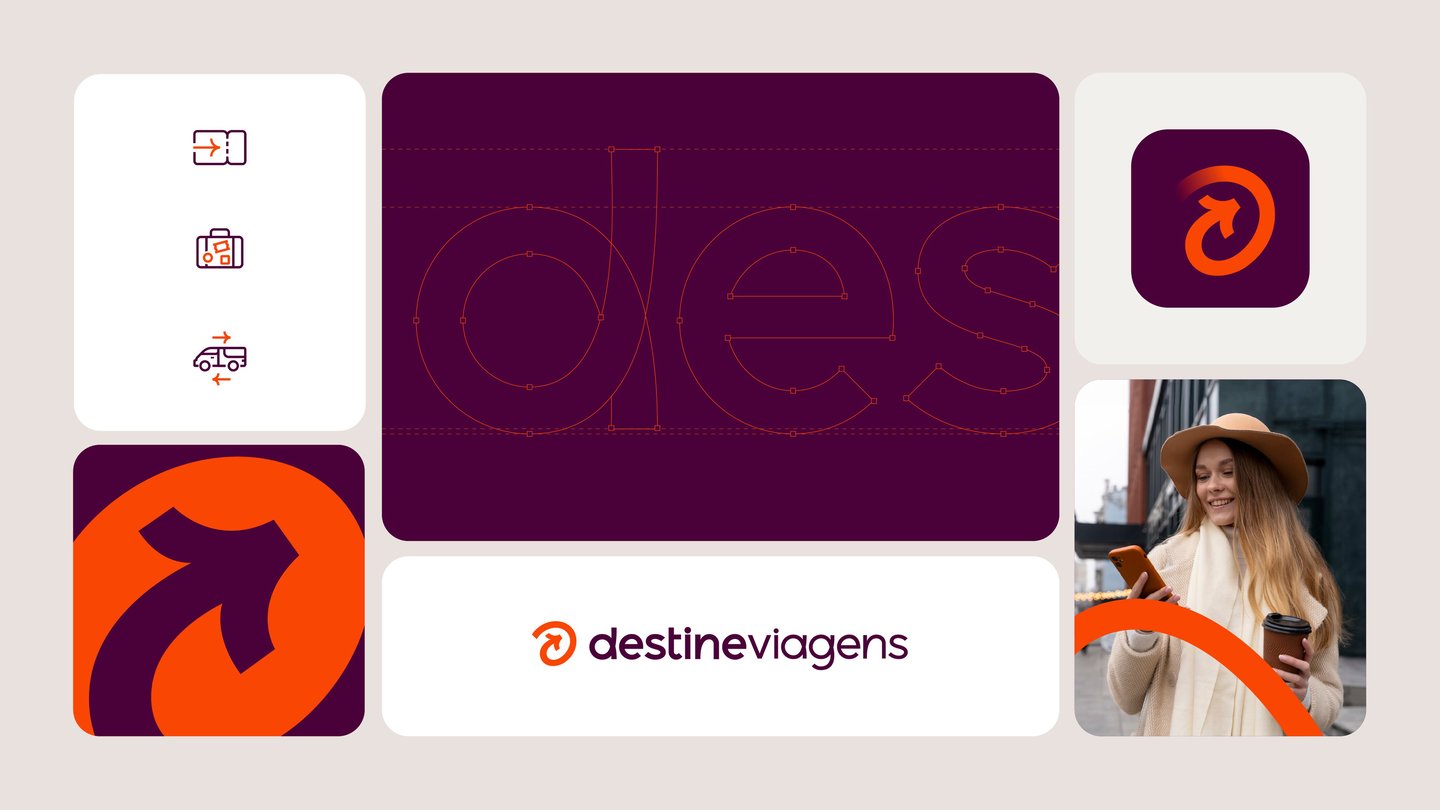
Together with the client, we decided to create a strong, recognizable symbol as the brand's primary representation. This symbol needed to convey a clear and direct message to the public, so we chose the arrow as the base. It simply conveys what the company is and what it stands for. A brand that accompanies its customers from the beginning to the final destination and back on each journey. The typography, with its sinuous and curved shapes, represents the concept of a path, of a journey, and of adventure ahead. The graphic universe further connects the brand to the public, with custom illustrations representing some of the services the company offers, as well as exclusive iconography and freely drawn line elements that represent the various paths and challenges of a journey.